Logo Identity

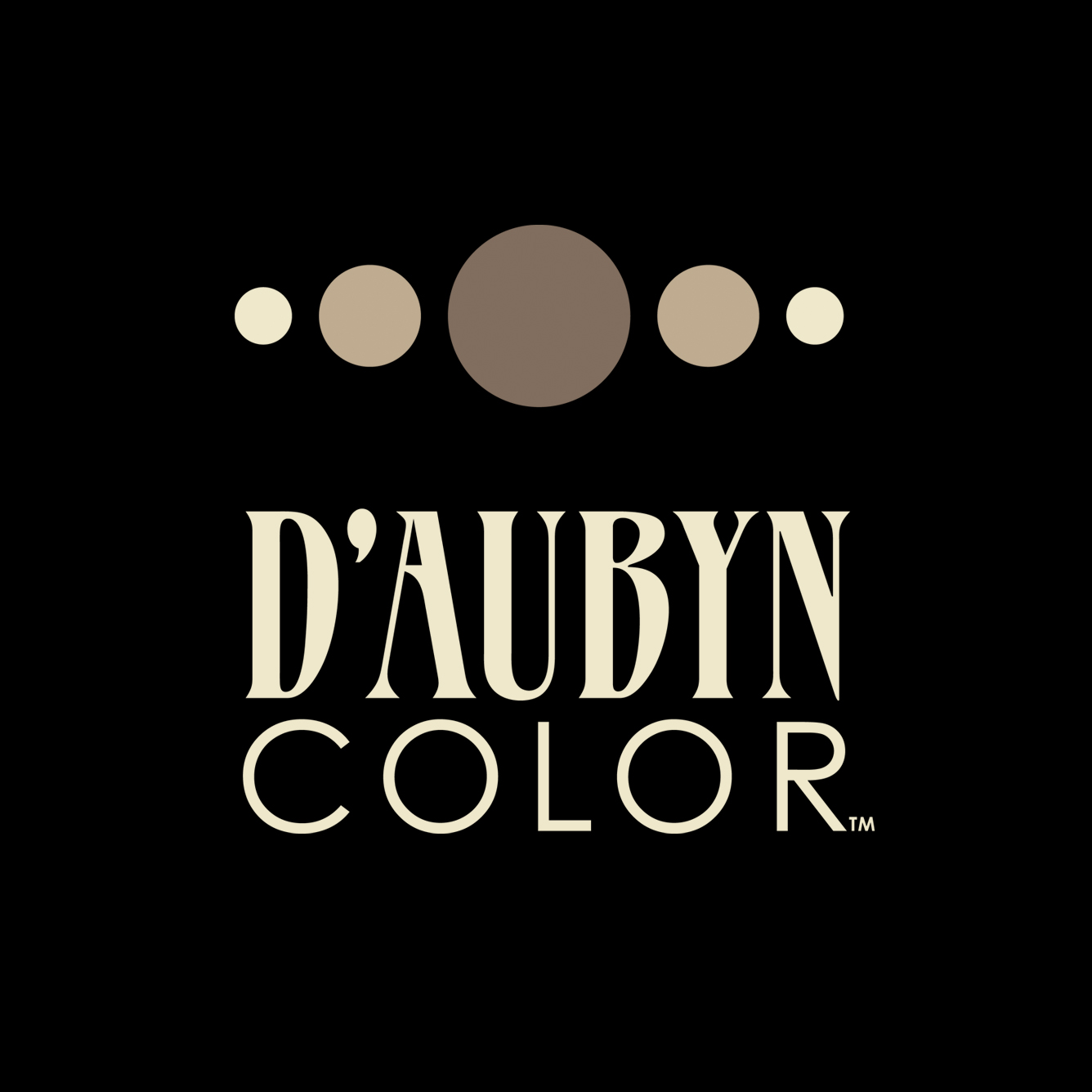

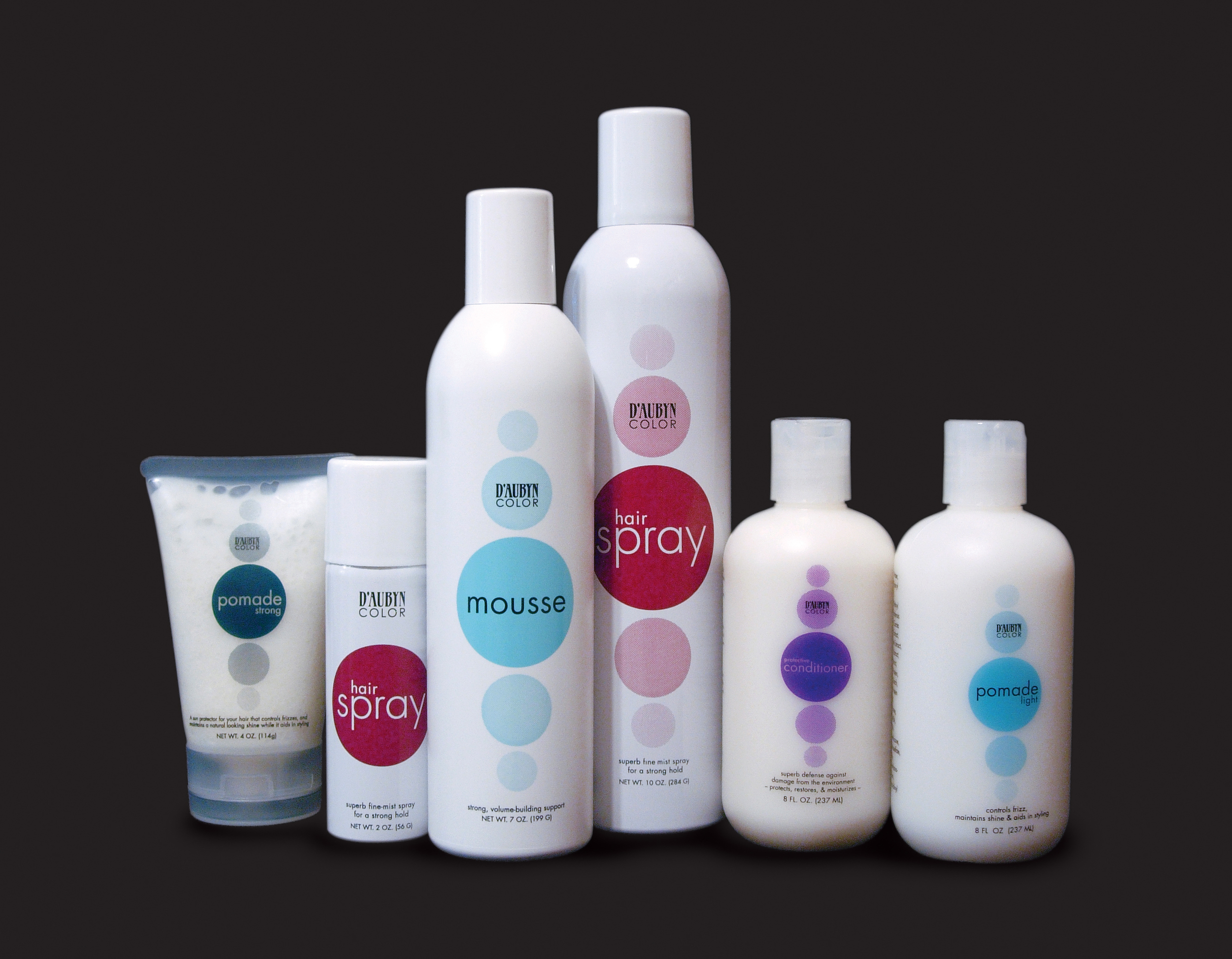
D'Aubyn Color
D'Aubyn Color™ brings the beauty of youthful-looking hair color to you. And Sommerset Design brought the beauty of branding to D'Aubyn Color. Revolutionizing hair color through their naturally-occurring hair color system makes hair color accessible to all. Our identity package told D'Aubyn Color's story on every piece – from appointment cards to newsletters and packaging.


Before & After
A shift in D'Aubyn's focus from full service salon to professional hair color line necessitated a rebranding. Keeping the unique flavor of the original logo, we gave it makeover – and applied the look to a complete marketing system.


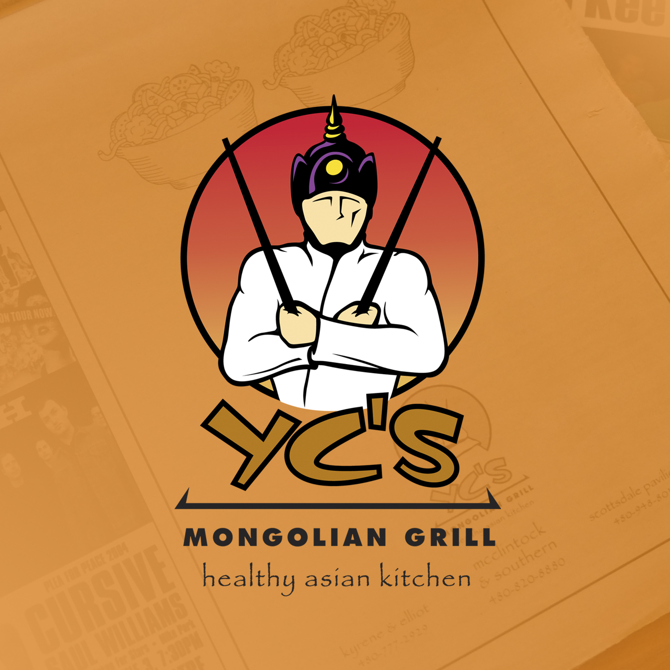
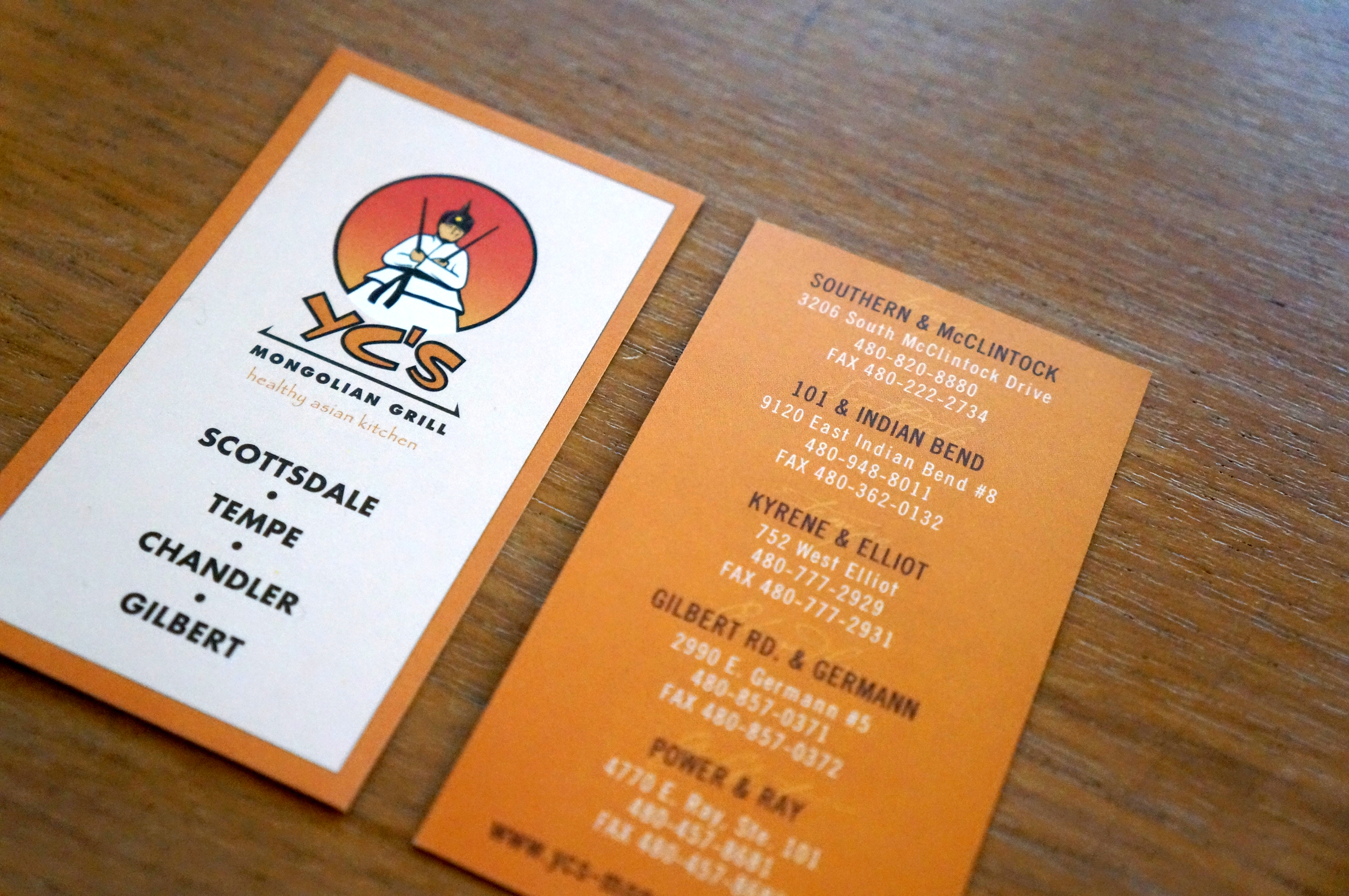
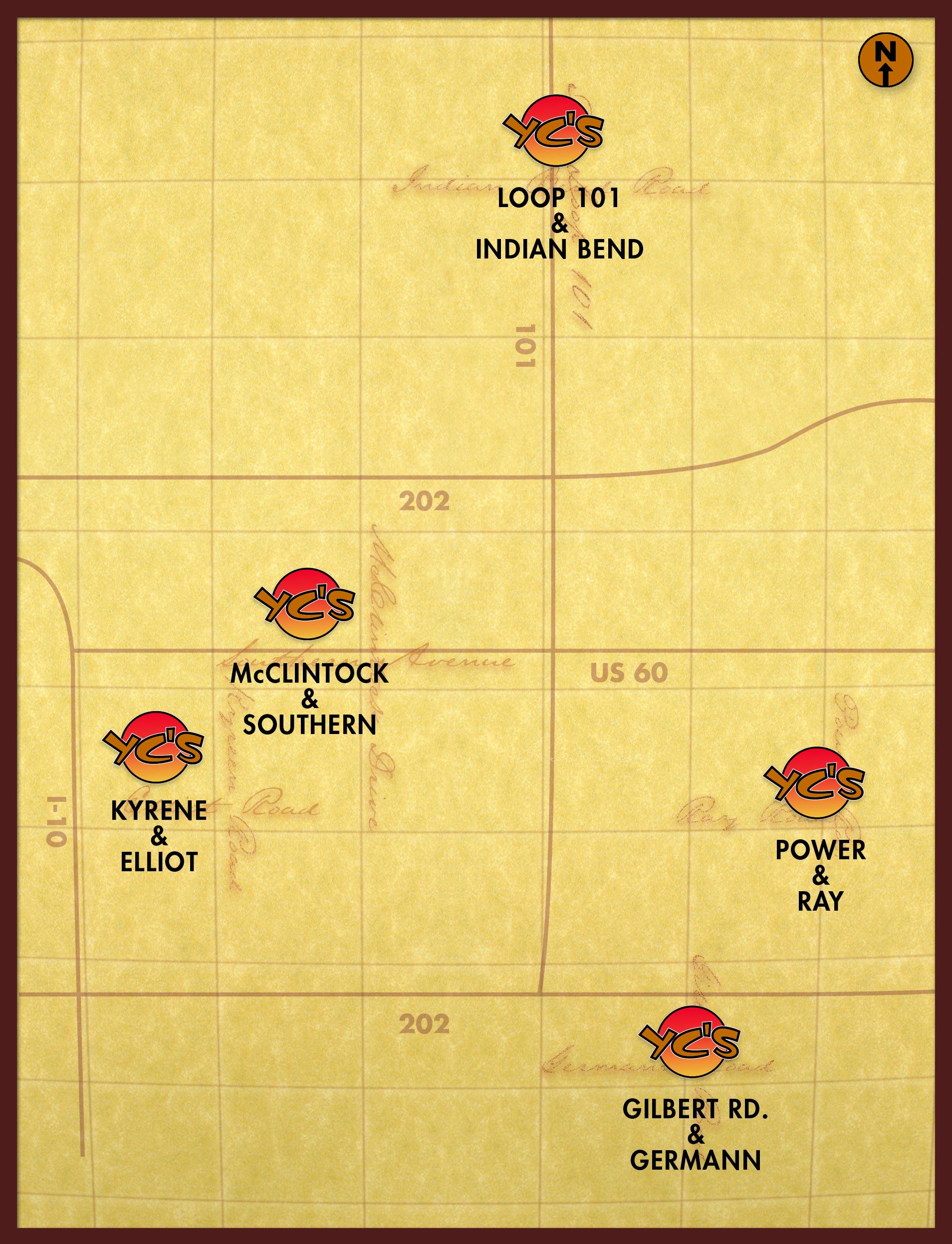
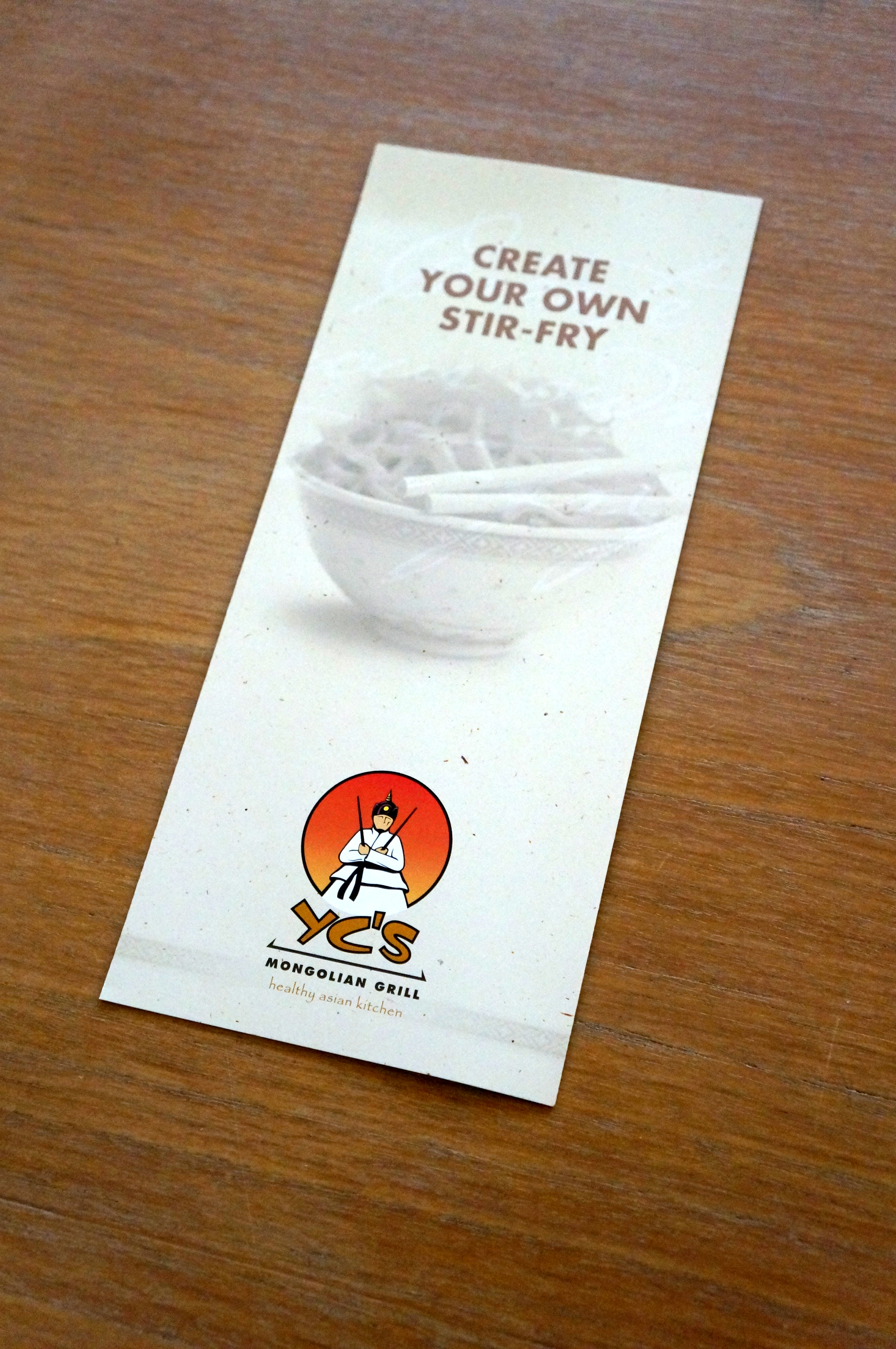
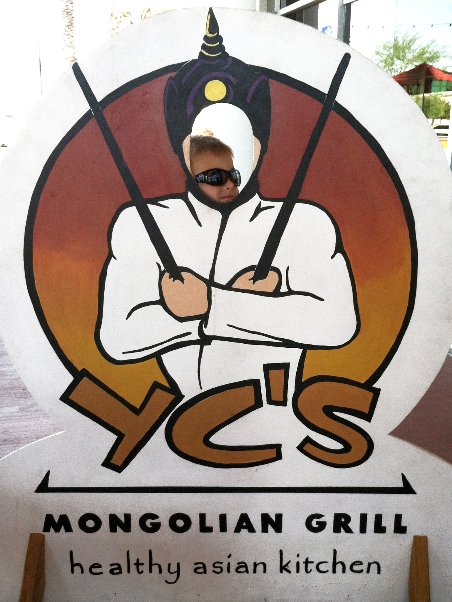
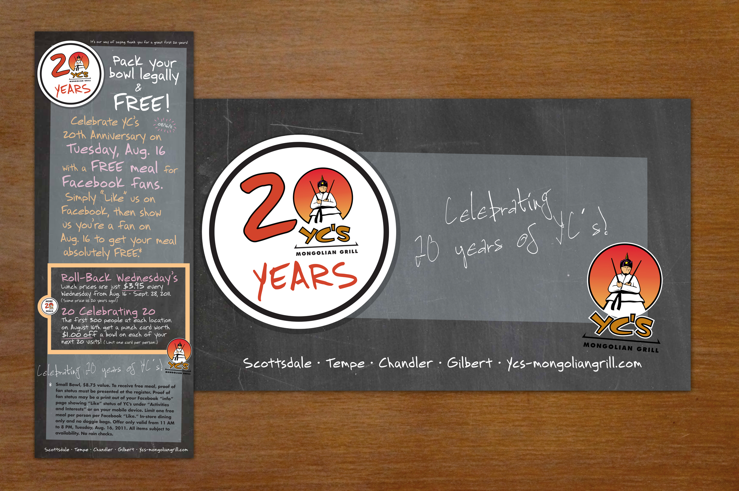
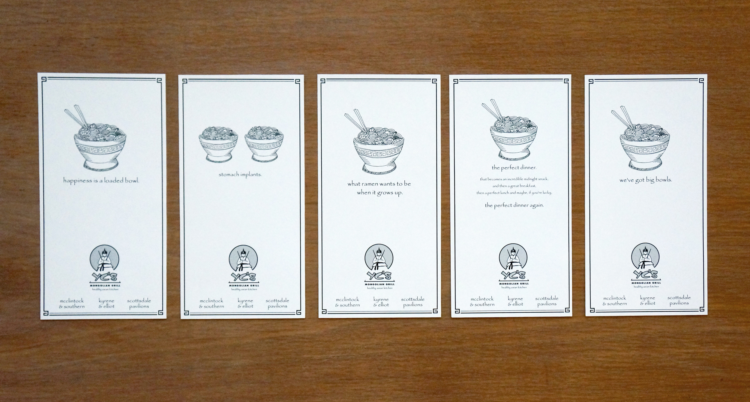
YC's Mongolian Grill
A healthy Asian kitchen with a unique point of view, YC's Mongolian Grill been one of Arizona's favorite dining destinations, as well as a pioneer in the quick service restaurant industry. We worked with YC's, rebranding their restaurants, focusing on healthy ingredients, flavorful options, and their fun, do-it-yourself atmosphere. The fictional character and brand have become well-known as YC's has expanded, and it's influence on others in the field is the most sincere form of flattery.

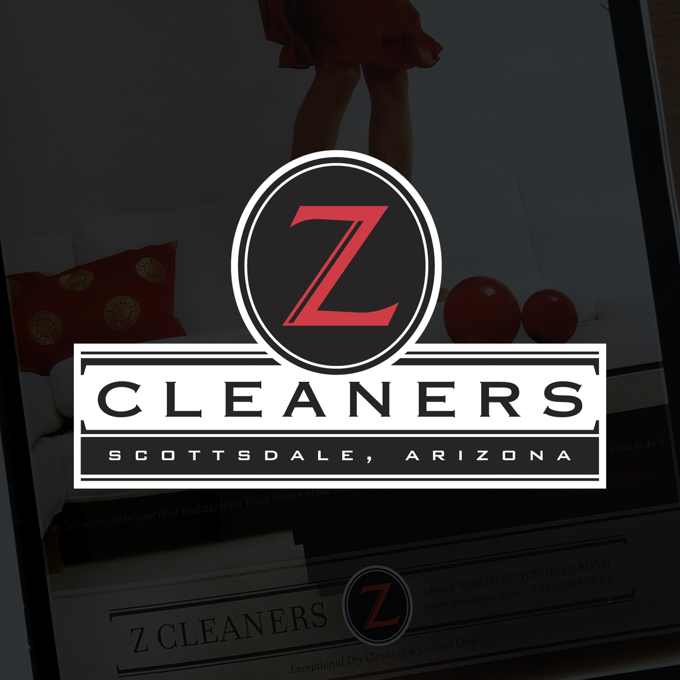
Z Cleaners
Exceptional dry cleaning and laundry services require a extraordinary identity. In establishing Z Cleaners as the premier dry cleaner in Scottsdale, we developed a brand that exudes luxury and likability, appealing to the most discerning customers.


Before & After
A logo that had poor curb appeal was replaced with a sophisticated seal. The brand emphasizes strength, and imbues tradition, all while keeping the identity clean and fresh. The new logo is remarkably legible for use on all materials – magazine campaigns, digital, outdoor, and hangers for your door.


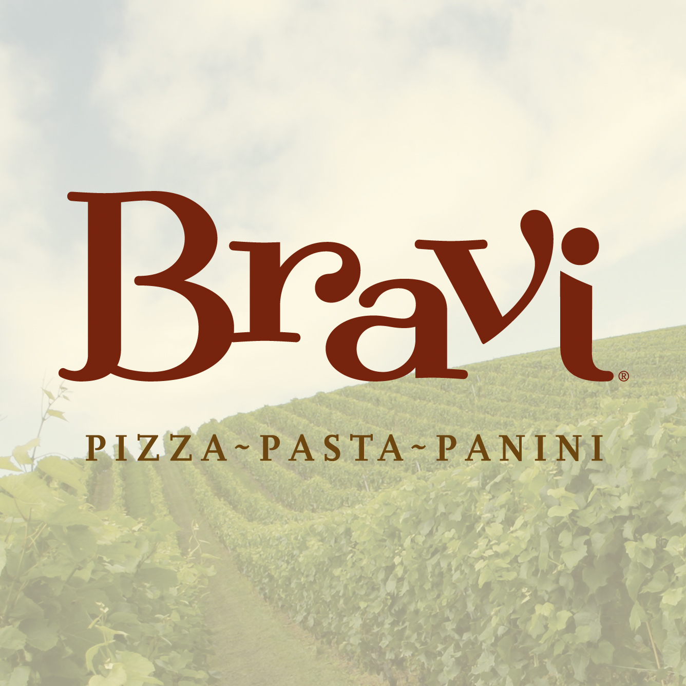
Bravi Tuscan Kitchen
The fresh ingredients and quality of a fine restaurant meet the convenience and ease of counter service. Bravi's identity is playful, warm, and inviting. Customers are transported to Tuscany with Bravi's flavors and image. No detail is overlooked as we conjure images of Tuscan vineyards with abstract grapevines and hand-painted tiles in everything from "Bravi On The Run" to-go magnets to the oversize, overhead menu board.


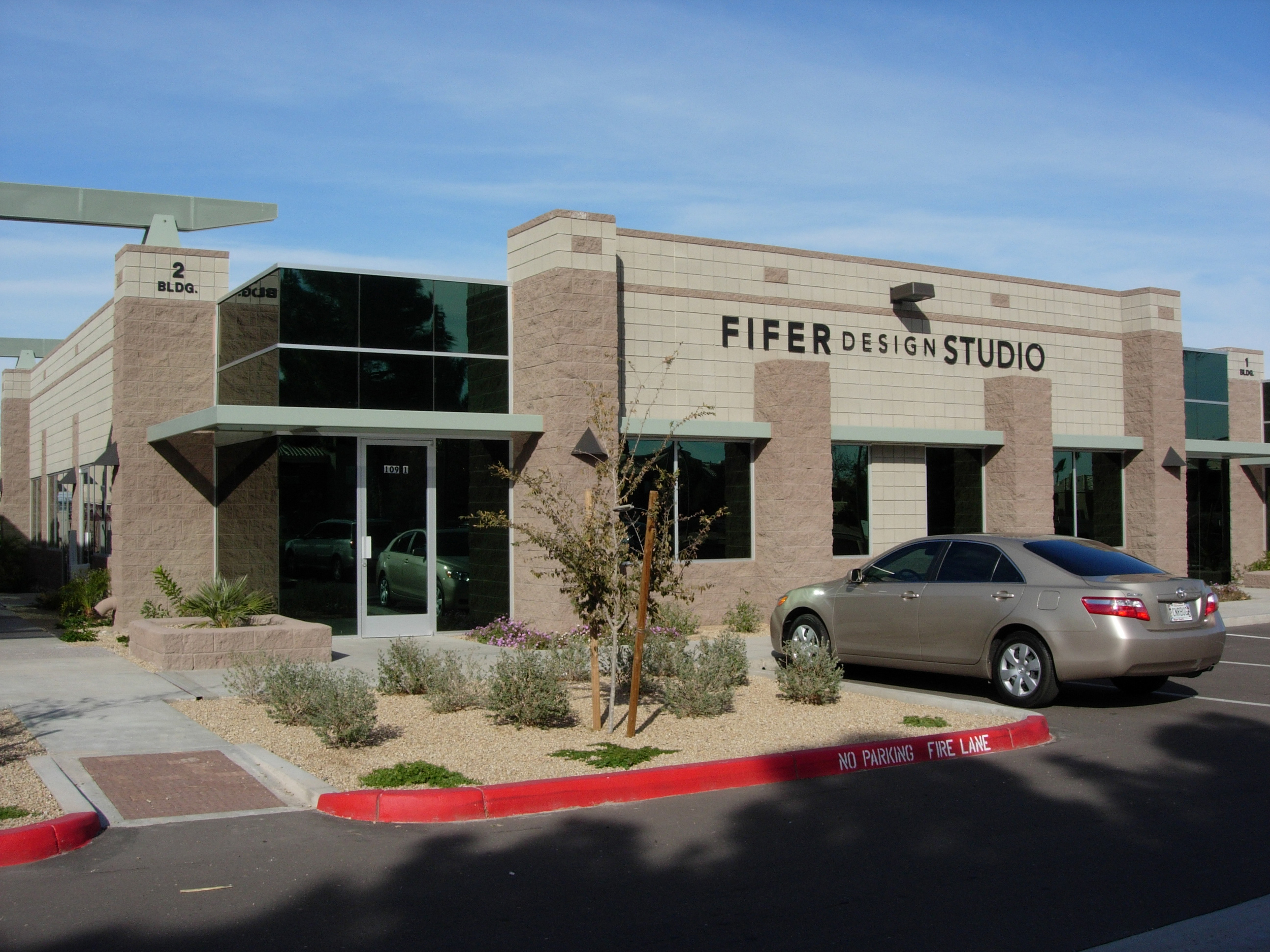
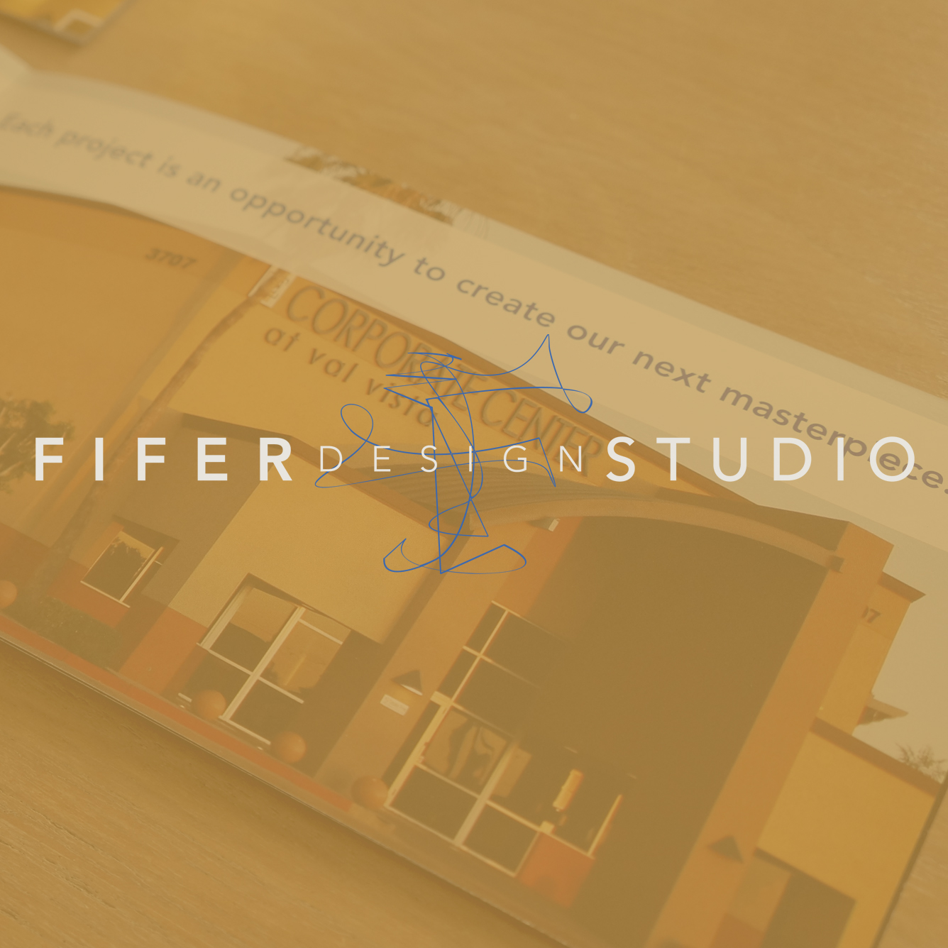
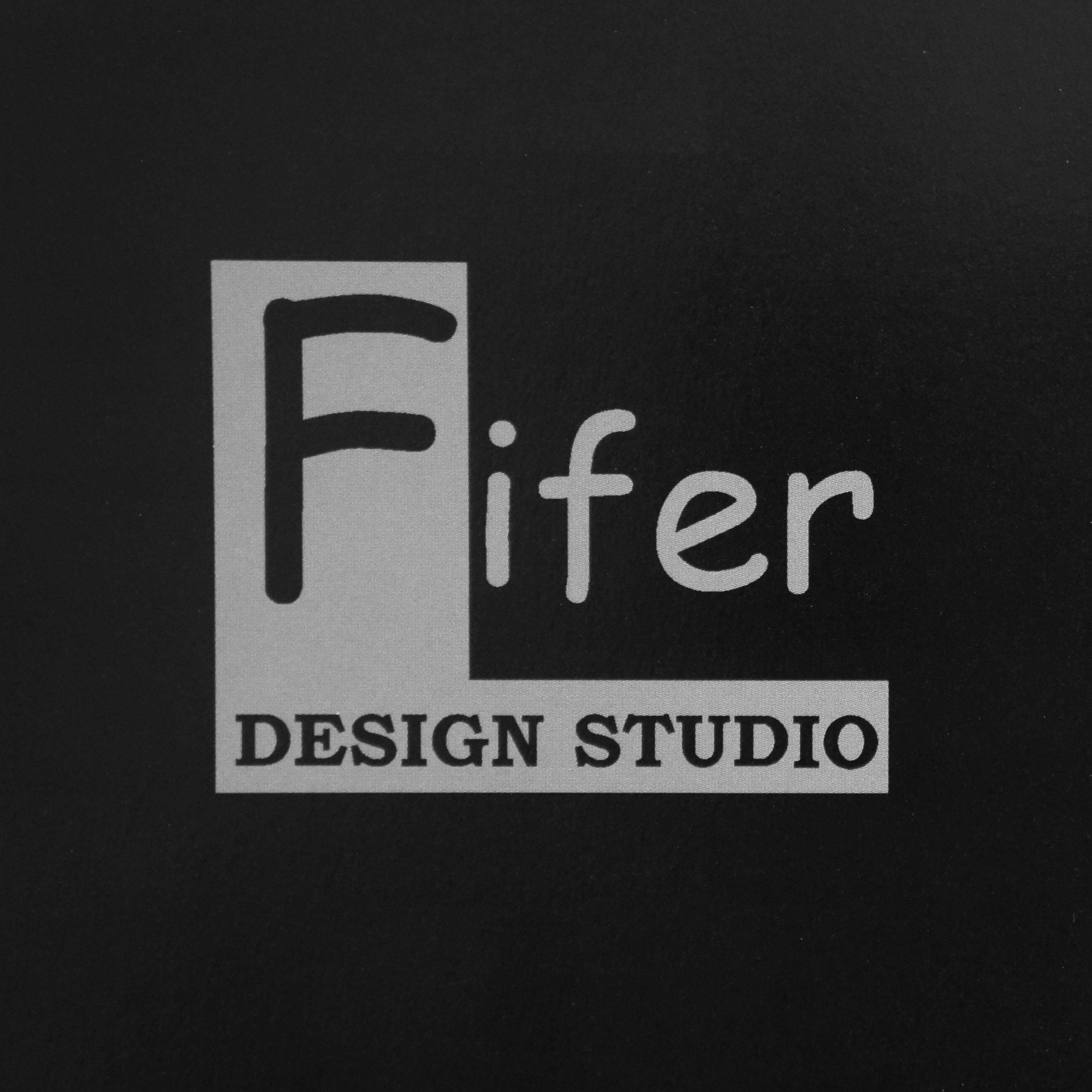
Fifer Design Studio
A commercial architecture studio with an impressive portfolio came to us for a brochure. We delivered as promised, and the foundation was laid for a beautiful partnership. We developed a new identity for Fifer Design Studio, creating a unique launch event at the open house for their new studio. Each invitation contained an actual key, but only one opened a very special prize.


Before & After
Fifer Design Studio's impressive portfolio of projects was hampered by an image lacking in sophistication. A new logo inspired by the hand drawn sketches by the studio's premiere architect is the perfect answer to Fifer Design Studio's identity struggle.